In this section, you can manage all the site settings of your node. To access the Node Settings menu, follow the instructions below.
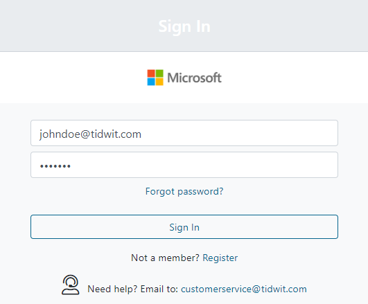
Sign-in to your TIDWIT Ecosystem

In the upper left corner click on the Menu button. The left-hand side panel will display, and you will see icons corresponding to the different apps and workloads available on TIDWIT. The first three icons correspond to the Users section which is explained in the User Manual. The remaining icons are only visible with an administrator profile. If you can’t see them and you are an administrator, ask your TIDWIT portal administrator to give you the required permissions.
Node Settings
To go to the Node Settings section, place the mouse pointer over the Settings icon. Four new tabs will appear, each with different setting functionalities.
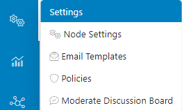
Click on the Node Settings tab and you will be directed to the Node Settings window. You will see ten tabs on the page, each with different setting options.

General Tab
The General Tab is the first tab you will see on the Node Settings page. You can change and set up the site configuration using this tab.
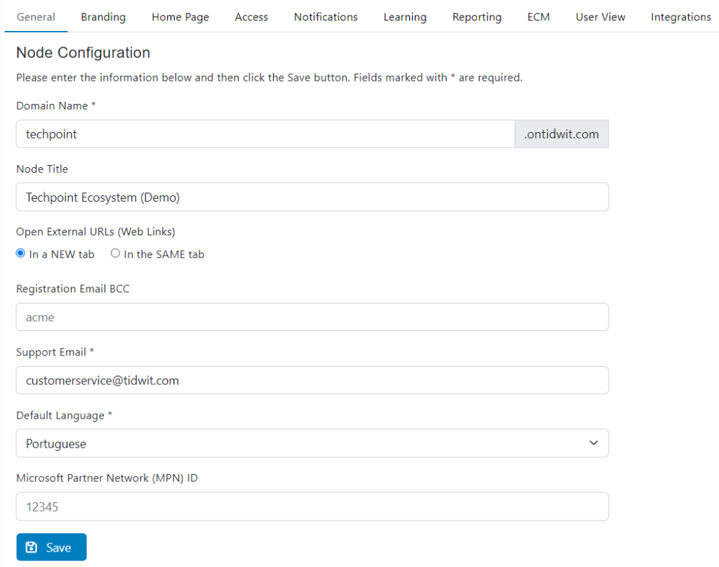
- In the Domain Name field,write the domain your node will have on TIDWIT. (e.g. ibm.ontidwit.com).
- In Node Title field, write the title that will appear on the top middle part of the screen. This title will be visible in all pages of your node to all users.

- In Registration Email BCC, enter the email address copied as BCC to receive all user registration notifications. This feature is used to inform the platform Admin(s) in real-time of new users registering an account via email notification.
- In Support Email, enter the email address you want to use to receive user support requests (platform users can fill-in and submit a support request by clicking the “Support” link under My Profile).
- In Default Language, select the default language in which the platform User Interface will be displayed.
- Click on Save.
Branding Tab
Click on the Logos tab to upload your company logo which will be visible throughout your TIDWIT node.
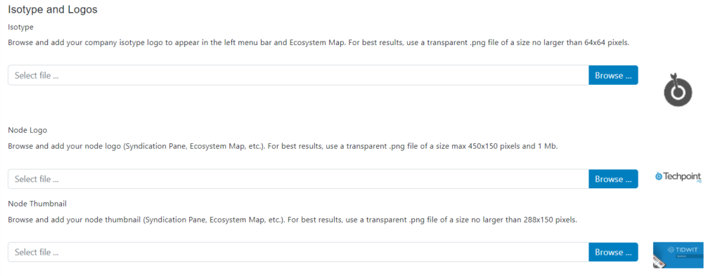
- Click on the Browse… button to upload your company’s Isotype, using a transparent 64×64 pixels .png file.
- Click on the Browse… button to upload your company’s Node Logo, using a transparent 450×150 pixels .png file. This logo will show up in the Syndication Pane, in your Ecosystem Map, etc.
- Click on the Browse… button to upload your company’s Node Thumbnail, using a transparent 288×150 pixels .png file. This thumbnail will show up in the Syndication Pane, in your Ecosystem Map, etc.
Home Page Tab
Click on the Home Page tab to set up your node’s home page overview.
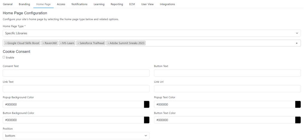
In the Home Page Type dropdown menu, select the content that will be visible on your node’s home page. Choose if it will be “All Published Libraries,” “One Library,” or “Specific Libraries.”
- All Published Libraries: Users can view all public libraries published by the node administrator
- One Library: Users will be able to access the content in the library selected by the node administrator
- Specific Libraries: Users will be able to access the content of the selected libraries by the node administrator
(Note: In the dropdown menu below, choose the Library or Libraries that will be displayed if you selected “One Library” or “Specific Libraries.”)

- Custom: The node administrator will be able to design the home page as he/she wishes through design palettes that were implemented in tidwit
To access the Homepage Editor, click on customize home page and a new interface will be displayed.
Using the drag & drop functionality you can add blocks to the home page and then click on Properties to customize.
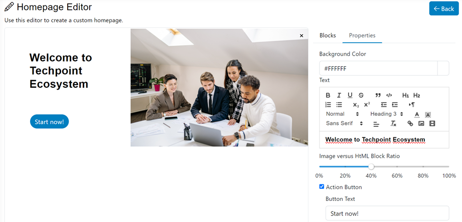
Once you have finished your design, click on the save button and when you refresh the home page you will see the new interface.
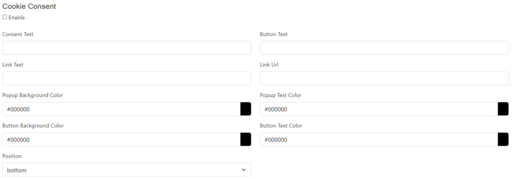
- Check the Cookie Consent checkbox to show a cookie consent message when users access your node for the first time or uncheck it to disable it.
- In the Consent Text field, write the text that will appear in the cookie consent message.
- In the Button Text field, write the text that will be displayed in the cookie consent button.
- If you need to link to your company’s privacy policy page, make sure to populate the “Link Text” and “Link URL” fields accordingly.
- In the Popup Background Color field, select the color for the cookie consent popup message background.
- In the Popup Text Color field, select the color for the text of the cookie consent message.
- In the Button Background Color field, select the color for the button background.
- In the Button Text Color field, select the color for the text of the cookie consent popup button.
- In the Position dropdown menu, select if the cookie consent message will appear on the top or on the bottom of the screen.
Banner Section
Your company banner will appear on top of the homepage.

- Click on the Browse… button to upload your company banner for the desktop version of your node. Use a transparent .png file with a maximum size of 1920×250 pixels for best results.
- Click on the Save button on the bottom left part of the screen.
Example of an node without a banner:

Example of an node with a banner:

Node Colors
In the Site Styles tab, you can manage your node’s general color settings.

Select the colors for:
Top Bar

Left Bar
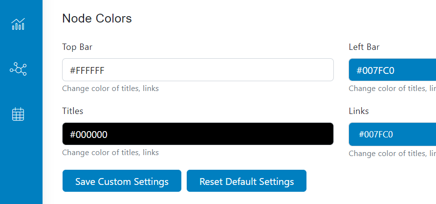
Header Background
Titles
Links

Buttons

After making all the color changes, click on the Save Custom Settings button.
Countries Tab
In the countries tab, select the countries that will be available for selection by users on the user registration screen. Note: Users may still register from outside the selected countries if they select one of the available countries on the registration screen.
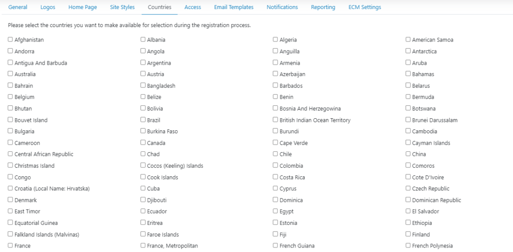
Click on the Save button on the bottom left part of the screen.
Access Tab
In the Authentication dropdown menu, select how users will have to enter their credentials.

There are two main ways to authenticate and access. First, users can authenticate using the traditional method of username and password. Alternatively, we offer Single Sign-On (SSO), allowing users to log in using credentials from another compatible system.

Access Type
Regarding access to the configured nodes, there are two available options to access your node: “Open” and “Restricted.” An “Open” configuration allows any user to autonomously register and freely access the node. Conversely, a “Restricted” configuration requires users to be previously registered before accessing.

The “Open” access type allows you to set the registration and login rules to the node being configured.
The “Restricted” access will only allow you to access if you have previously registered.
Click the Open Access Type to access the next configurations:
User Registration Options
Elegible Domains
In the Domain Names section, enter the eligible domains that will have access to your node. Add the domains you want clicking on the plus button.

Countries
You can choose the countries you want to make available for selection during the registration process.
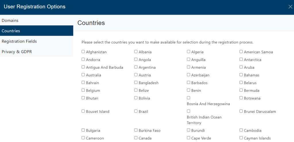
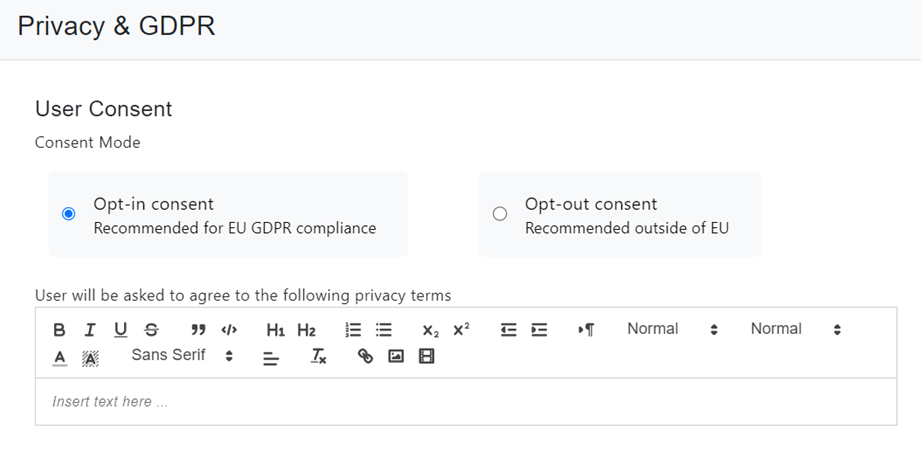
In the Privacy section, select the Consent Mode and write a message to appear to users regarding the privacy policies.
Registration Fields
It allows you to create different fields from the default ones, to have a more detailed classification of the user’s information in relation to the site’s purpose.
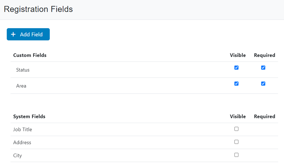
To create a custom field click on Add Field, then select the type of field you want, you can choose from: Text field, Check box, Radio and Drop down. Then assign a name to the field and click on save.

Privacy & GDPR
It also allows you to set the use of private data by user consent.
Click on Save and close the wizard.
Site Discovery
Select Open to allow users to navigate -but not consume- your content without logging in, or select Gated to allow only registered/logged-in users to navigate and consume your content.

Notifications Tab
In the Notifications tab, It will allow you to select and configure which notifications will be allowed in the node.
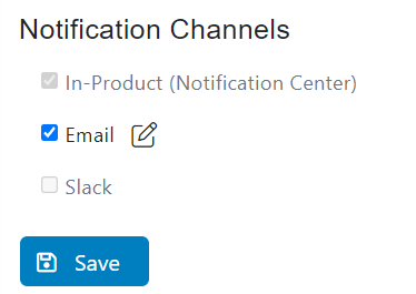
In the Email Templates tab, select the email templates that will be used to send the corresponding platform notifications. You can learn more about Email Templates and how to create them by looking at our Email Templates manual.
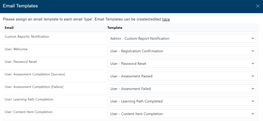
After marking the options you want to enable for your node, click on the Save Changes button.
Learning Tab
Activity Completion Settings
Allows you to set the rules that will be considered when completing the different types of content available on the node in relation to partners / vendors.
Autocompletions
When choosing this option,
- For partners / vendors that do *not* have a learners’ progress API, the activity will be marked as complete as soon as the user opens the corresponding link (either by clicking ‘View Now’ from the content item page or by clicking ‘Start’ from the learning path listing page).
- For partners / vendors that do have a learners’ progress API, the completion is automatically fed back to TIDWIT once the user has completed the activity on the partner / vendor platform.
- For embedded content such as images, .pdf / office documents, and .mp4 / YouTube / Vimeo / Vidyard videos, the completion is either based on the user opening the image / document / video or based on custom completion thresholds that can be configured further below.
Prompt users about content items ‘auto-completion’ when clicking the ‘View Now’ button. (You can edit the message as needed).
Enable custom threshold for embedded videos and .pdf documents

User-acknowledged completions
When choosing this option, all content items will be marked as complete as soon as the user acknowledges the completion (by clicking the Mark as Complete button from the content item page, from the learning path page, or under My Activities).
In addition, for partners / vendors that do have a learners’ progress API, the content item will be flagged as ‘Verified’ on TIDWIT as soon as the completion is confirmed by the partner/vendor platform.
Exceptions: the below listed partners / vendors will be set to auto complete (meaning users will *not* be asked to acknowledge the completion as it will *solely* be based on TIDWIT receiving the completion confirmation)

Activity Completion Confirmation
Through this option, new possibilities will be available to promote key functionalities in the content completion process.
You can:
- Send completion notifications for the following activities:
- Learning Paths (includes a ‘certificate of completion’)
- Assessments (includes the assessment ‘pass/fail status & score’)
- Courses (Self-Paced and/or Instructor-Led)
- On-Demand Webinar / Session
- Hands-On Lab / Practice
Turn on learning path completion certificates
Learning Path Enrollment Options
According to your organization’s needs, you can allow registered users to access the learning paths in two ways, the first would be mandatory and the second would be optional.

Reporting Tab
In the Reporting tab, select all the default settings that will appear on the different reporting sections of your node.
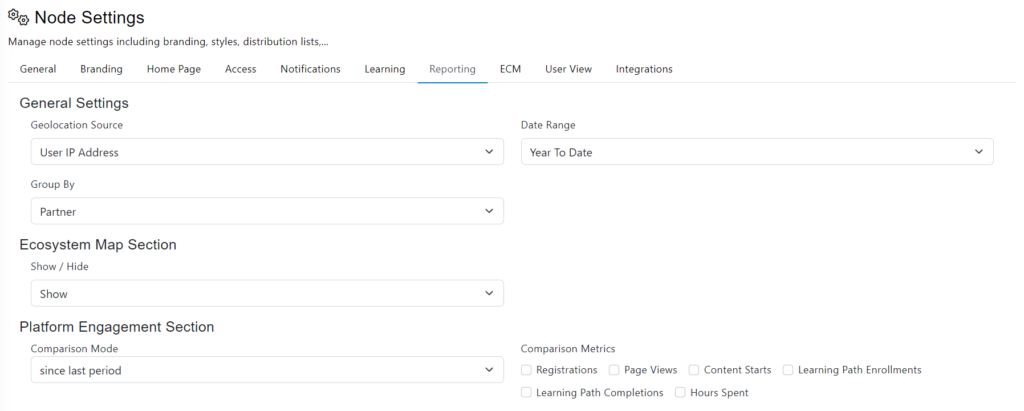
General Settings: In the Geolocation Source menu, select which data will be used to identify the users location for the geography reports. Select User IP Address to use the IP given by the browser during the registration process, or select User Profile to use the selected country by the user. In the Date Range menu, select the default date range to appear on the report filters.
In the Ecosystem Tree Section, select if the Ecosystem Tree will be hidden or shown by default when accessing the reports.
In the Platform Engagement Section, select the default comparison mode and comparison metrics to appear on this report.

In the Geography Report section, select the default sorting for this report.
In the Content Report section, select the default Asset Type and sorting to appear on the content report.
In the Learning Report section, select the default sorting for the View Details button.
Click on the Save button.
ECM Settings Tab
In this tab, select the default settings to appear when creating a new library using the TIDWIT ECM app.

Select the default syndication mode (Public or Private), the default language, publisher, asset type and source type.
Click on Save.
User View
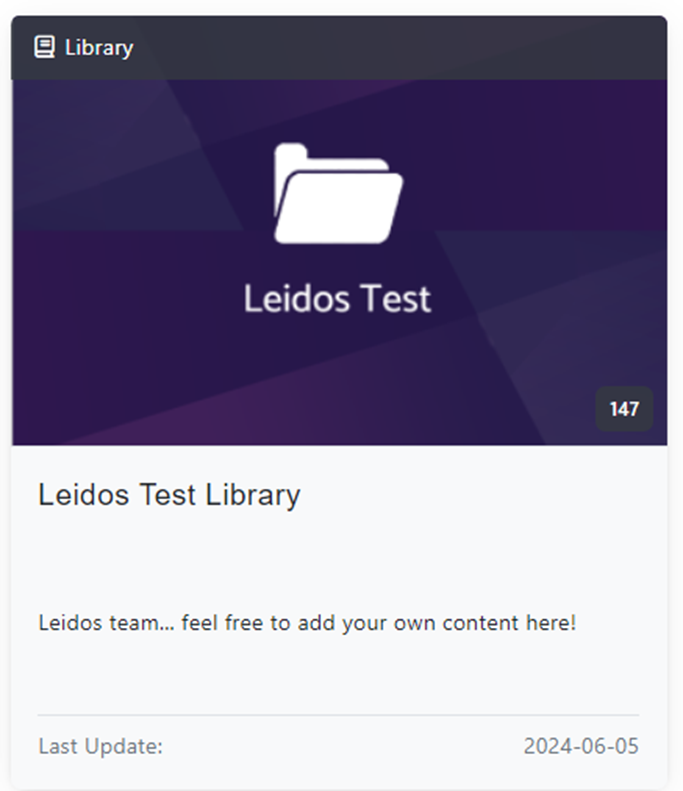
The platform automatically updates and displays the date of the last modification of all libraries and content items available to all users.
Moderate Discussion Board
Moderating the discussion board involves actively managing interactions between participants to maintain a respectful and constructive environment. The moderator is responsible for ensuring that the rules of conduct are followed, and that the discussion is around the main topic.

You can use the search bar and filter to classify the information you want to see.
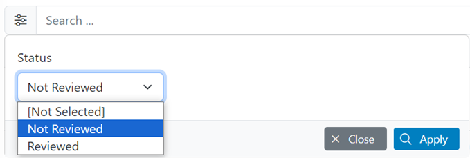
You can also use the bulk edit functionality to Mark as Reviewed & Delete Post.
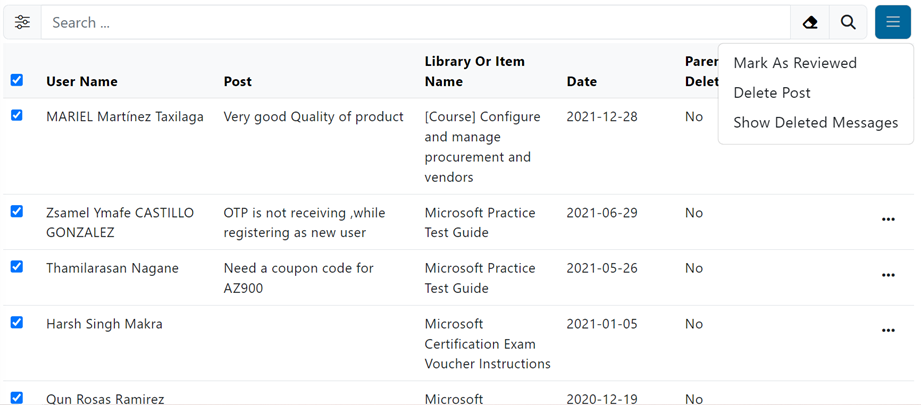
Through the three dots you will be able to Mark as Reviewed, View Post & Delete Post.

Mark as Reviewed
Once the comment is marked as “Reviewed” it will no longer appear in the list and you will be able to access all reviewed comments through the “Reviewed” filter.
Through the three dots you will be able to View Post & Delete Post.

View Post
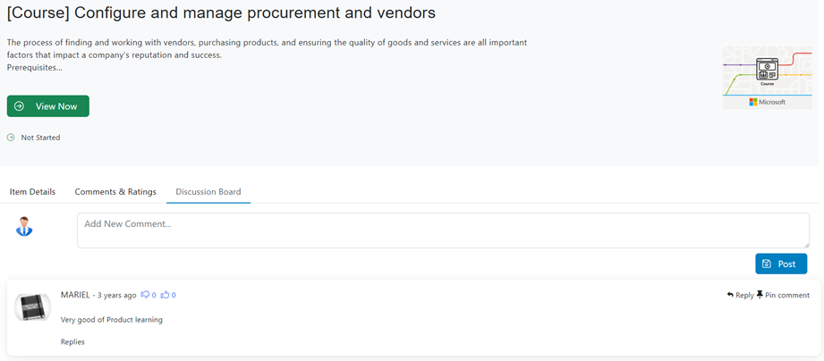
Once you click on view post, you will be redirected to the main page of the content to which the comment was added in the discussion board section specifically.
Delete Post
If you find a comment offensive, you are free to delete it from the post.
You can find this option on the right side of the search bar.
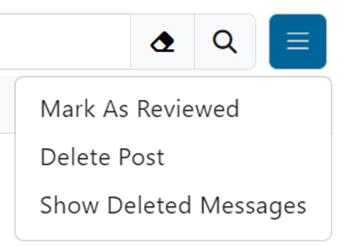
Note: This can be reverted.